Tuesday, 10 November 2026 | Posters
The Frame Matters: How to Choose a Frame, Mat, and Backing for a Retro Poster

An original graphic from a bygone era can completely transform an interior, bringing in a note of nostalgia, authenticity, and timeless chic. Yet it often happens that even the most beautiful vintage motif loses its charm when it falls into random hands or is hung without prior preparation. If you're wondering, how to choose a frame, passe-partout, and background for a retro poster, you should know one thing: the right framing is not just an aesthetic addition but a key element that protects the paper and builds the mood throughout the entire room. Discover the secrets of professional framing selection, thanks to which your piece will gain a setting worthy of a true art gallery.
The choice of the profile in which you decide to frame your paper treasure depends primarily on the era the graphic comes from and the dominant style of the interior.
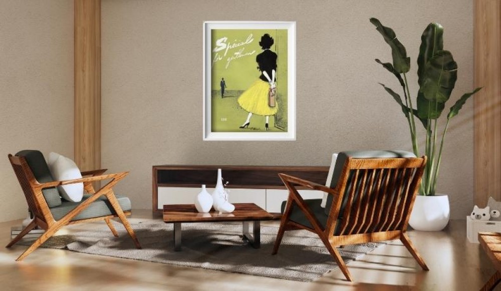
Natural wood in warm tones pairs perfectly with posters from the 1920s–60s. Warm browns, walnut, or oak beautifully complement the organic colors of modernist illustrations from the mid-century modern era. Metal frames in gold or brass, on the other hand, suit art déco posters – geometric, luxurious motifs from the 1920s and 30s need a noble shine to highlight their craftsmanship.
If your collection features the postwar school of poster art, a thin black frame is an excellent choice. This profile contrasts perfectly with bold typography and strong lines, without pulling the eye away from a complex composition. Wondering when an ornate frame works? Reserve that option for nineteenth-century lithographs, Art Nouveau posters, or works in the belle époque style.
Many design lovers face a dilemma: a traditional frame or a lightweight clip frame?
Clip frames are a minimalist framing option without a visible frame. A clip frame makes it easy to swap the poster, is cheaper, and is almost invisible, but it does not provide full protection for the edges.
Classic frames and frame moldings look far more sophisticated. A frame is more elegant and costs more than a clip frame, and its sturdy construction also protects the sheet’s corners from bending and mechanical damage. In addition, a traditional frame usually includes glazing, which protects the poster from external factors.
An interesting, lighter alternative for less formal spaces is wooden poster hangers that grip the print magnetically at the top and bottom.
What exactly is this element and why is the passe-partout so highly regarded among art conservators? This special cardboard mat, placed between the artwork and the outer frame profile, serves a double purpose. Above all, the passe-partout gives works of art elegance and depth, creating a visual buffer that allows the viewer’s eye to focus directly on the composition. The passe-partout highlights the aesthetic qualities of the framed piece, and edges precisely cut at a 45-degree angle create a subtle three-dimensional effect.
The second function is purely protective. A passe-partout separates the piece from the glass, protecting it from moisture. When paper touches the glass pane directly, condensing water vapor can cause mold and irreversible damage. The cardboard border creates a microscopic air cushion that lets the sheet „breathe” freely. For the same reason, a passe-partout prevents photographs from sticking to the glass – this rule is fundamental for both archival photographs and delicate retro graphics.
How should you choose a passe-partout from a technical standpoint?
Margin width: The standard passe-partout width should be at least 5 cm. The passe-partout width should not be less than 5 cm, and the width of the margins should be matched to the size of the work. In practice, a width of 5 to 10 cm works well for retro posters - a wider margin adds elegance and makes even a smaller format look monumental.
Window size: The cutout, i.e., the passe-partout window, should overlap the artwork by at least 0.5 cm on each side. This means the inner size must be slightly smaller than the dimensions of the retro poster itself so that the paper edges don’t slip out.
Material thickness: The standard thickness of a passe-partout is about 1.5 mm. For exclusive multilayer frames, the maximum passe-partout thickness is 4.4 mm, which creates an exceptionally deep chiaroscuro.
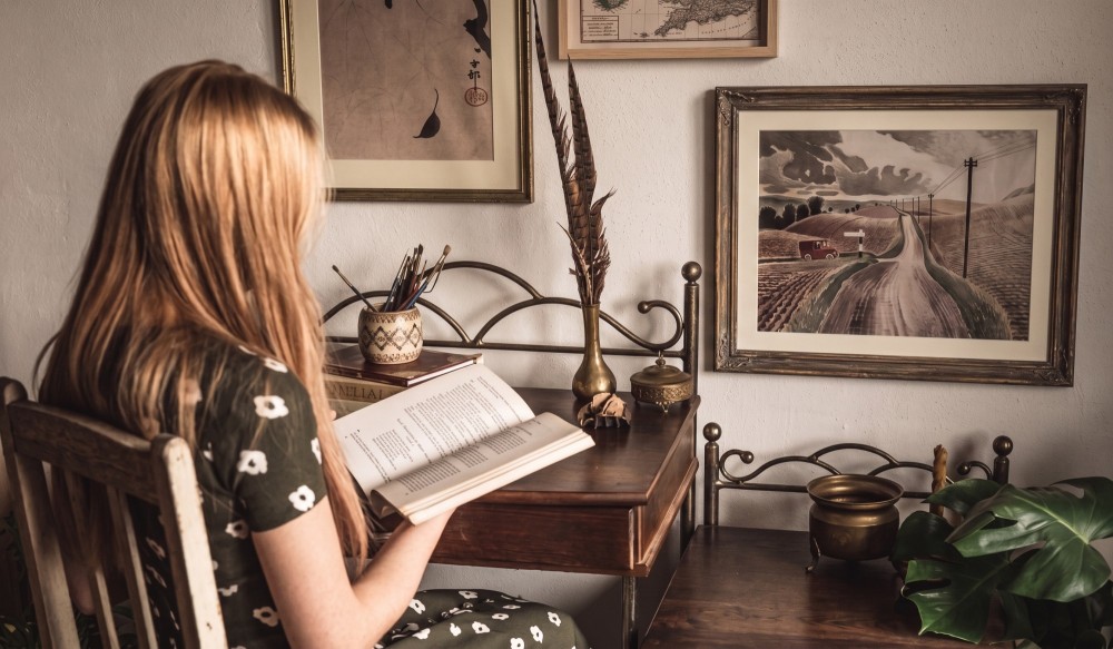
When considering, how to choose the color of the passe-partout, remember the rules of optics. Light passe-partout colors visually enlarge the image, adding lightness and space to the entire composition. Dark passe-partout colors, on the other hand, make the image appear smaller, enclosing it in an intimate, compact frame, which works great for graphics with strong, saturated contrasts.
The most commonly used passe-partout colors are white, ecru, and black:
White and off-white: Pure, snow white rarely suits aged vintage paper. Shades of off-white, ecru, or ivory work much better, gently echoing the natural patina of time.
Black and deep grays: A black border brings out color intensity and dynamism, perfectly accenting geometric movie or theater posters.
Color variants: If you want to introduce a colored passe-partout, choose a hue that appears in the poster as a secondary accent – for example, muted green, brick red, or a mustard shade.
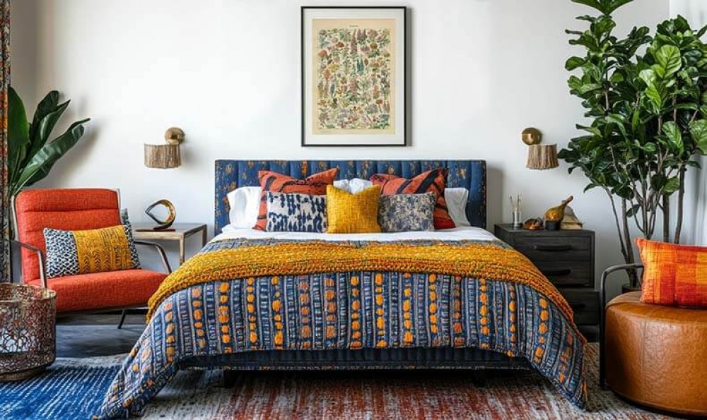
The background color should harmonize with the poster’s palette but must not compete with it. The passe-partout color should match the room’s accents, linking the artwork with textiles or furniture. Also make sure the passe-partout is in a different tone than the wall – this way the framed piece will clearly stand out from its surroundings, creating a harmonious contrast.
Even a perfectly chosen frame and passe background will lose impact if you ignore the space around them. The background on which the retro poster will be hung is hugely important for the final perception of the piece.
Wall color: On dark, saturated surfaces (bottle green, navy, graphite), a light passe-partout immediately draws the eye and evokes a refined, museum-like display. On light walls, it’s worth playing with a darker frame profile.
Proximity to other elements: A retro graphic rarely hangs in a vacuum. In modern interiors, it pairs beautifully with other decor accents. Notice how patterned vintage-style wallpapers, mirrors in distressed frames, neighboring canvas paintings, or wooden blinds in the windows can together build a unique atmosphere. All these decorations should form a cohesive ensemble in which the poster remains the main protagonist, not a lost detail.
The way you present it depends on how much space you have:
Soloist on the wall: A large poster in B1 or B2 format looks best hung centrally at eye level (the center of the piece about 145–150 cm from the floor).
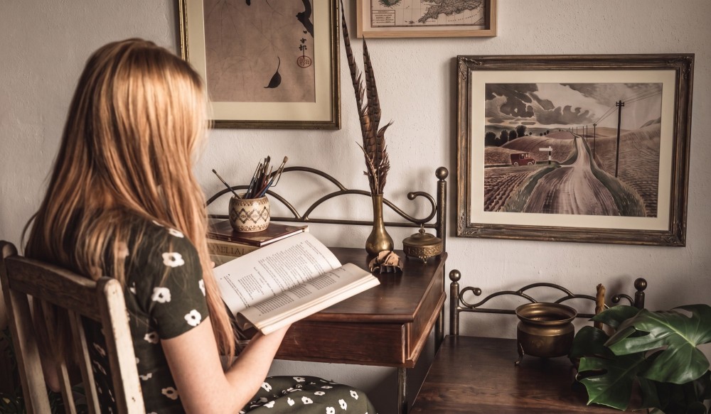
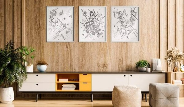
Atmospheric gallery wall: Combine several graphics of varying sizes. Pair simple, geometric frames with one richer vintage profile to create an eclectic living-room arrangement.
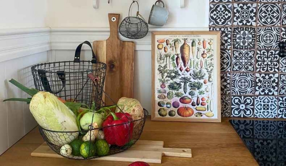
Casual arrangement on a sideboard: If you don’t want to drill into the walls, place the poster in a sturdy frame on a wooden sideboard, leaning it slightly against the wall amid plants and a lamp with a glass shade.
Unconventional forms: Though right angles reign, an oval passe-partout can be a brilliant accent for small botanical graphics or retro portraits.
Refined framing is a bridge connecting the historical atmosphere of bygone years with the modern space of your home. The right frame adds gravitas and protects the poster’s structure, the passe-partout builds depth, and a thoughtful background makes the poster an integral part of the décor.Choose proven solutions, reach for the right passe-partout, and create a private gallery on your wall that will delight household members and guests anew every day.