Tuesday, 16 June 2026 | Blog
How to choose the perfect vintage posters for the bedroom and kitchen?

Posters have something incredibly charming about them. They can transform interiors faster than new furniture, without requiring renovation, dust, or a big budget. All it takes is a well-chosen poster, the right frame, and a thoughtful spot on the wall for an ordinary space to gain mood, depth, and a personal touch. Particularly popular today are vintage posters, which evoke the charm of bygone times yet still work beautifully in contemporary arrangements.
In this guide, we suggest how to choose the perfect vintage posters for the bedroom and kitchen so that they match the interior style, emphasize its vibe, and encourage small yet impactful changes. It’s a great idea for people who want to refresh their home, add coziness, or create decor with soul.
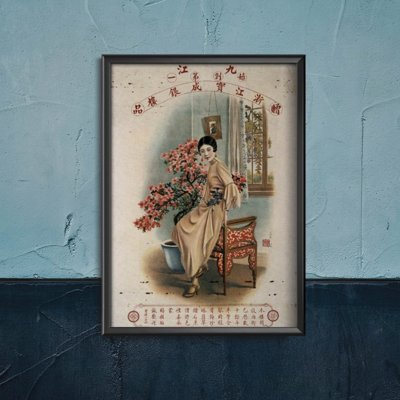
The vintage style is not just a trend for old graphics. It’s a way of telling stories through color, line, typography, and mood. Retro posters, vintage posters, and graphics inspired by the retro style often recall old advertisements, rail travel, classic films, old cafés, botanical atlases, or elegant fashion illustrations. On the one hand, they are decorative; on the other, they bring emotions and memories into the interior.
Vintage posters suit many arrangements. They look good in Scandinavian, boho, classic, rustic, eclectic, and even modern interiors. With the right motif, color palette, and poster size, the whole will harmonize beautifully with the surroundings.
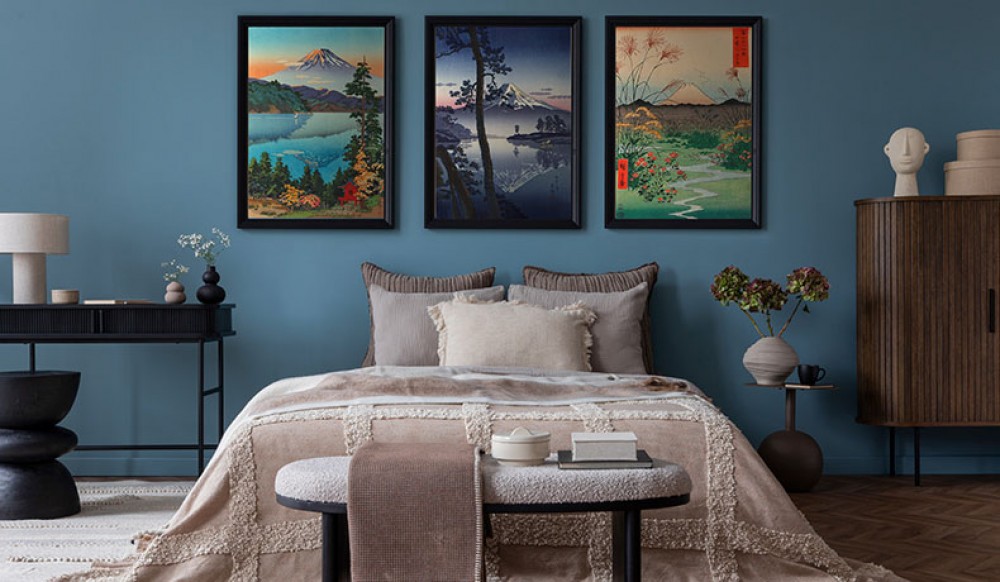
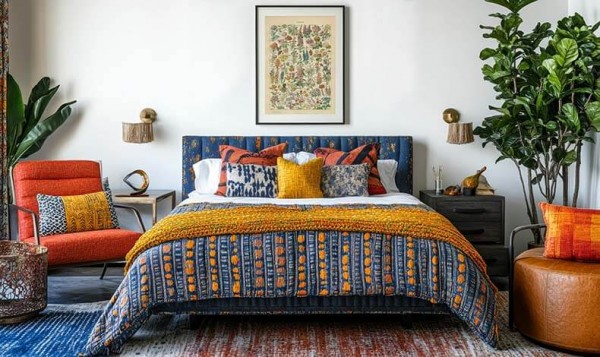
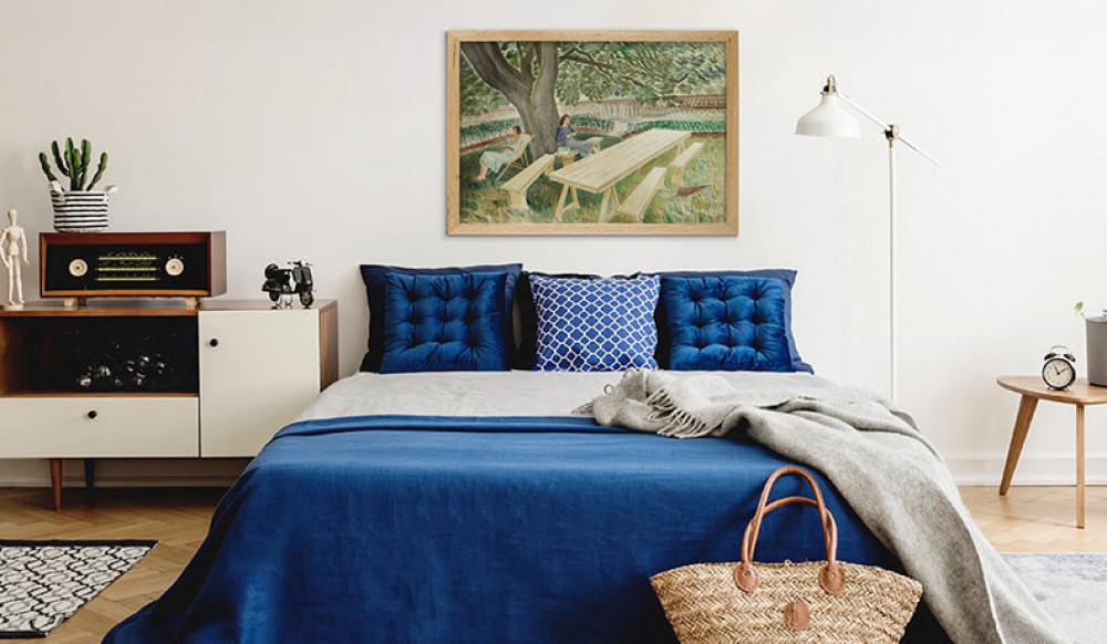
The bedroom is a place of rest, so when choosing decor for this room, it’s worth considering not only aesthetics but also mood. Posters for the bedroom wall should promote calm, build an intimate vibe, and make the space feel cozier.
In the bedroom, calm, warm, and slightly muted shades work best. Beiges, browns, creams, olive green, blush pink, navy, sepia, or soft terracotta will be a good choice. This palette pairs well with wood, soft fabrics, and natural light.
When choosing a poster for the bedroom, pay attention to whether its colors might be too intense. Very loud graphics can look striking, but they don’t always support rest. If you care about elegance and calm, choose vintage posters in subtle tones.
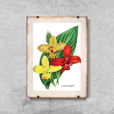
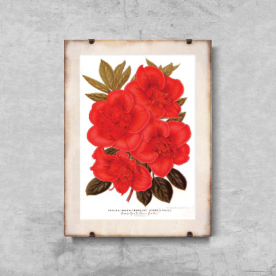
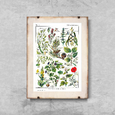
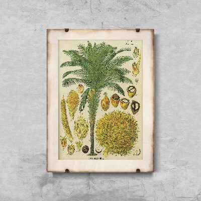
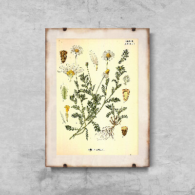
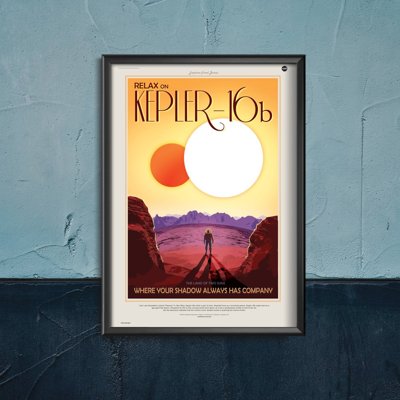
Floral motifs, botanical themes, old maps, delicate portraits, architectural sketches, beautiful landscapes, forest paths, mountain views, or romantic vistas inspired by travel fit the bedroom perfectly. Such illustrations are atmospheric but do not overwhelm the arrangement.
If you like interiors full of warmth, choose graphics straight from old herbariums or subtle reproductions of paintings. If a more modern lifestyle is closer to you, minimalist posters with a light retro touch will work, for example a simple line, aged color palette, or typography inspired by old signs.
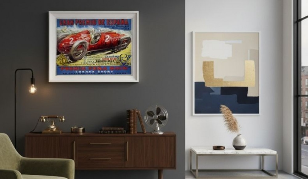
The most classic spot is the wall above the bed. One larger, well-chosen poster can become the focal point of the arrangement. Two or three graphics in a similar palette, arranged symmetrically above the headboard, also look interesting.
You can also hang a poster above a dresser, by a vanity, next to a mirror, or on a blank wall by the entrance. In smaller interiors, a good solution is posters in various sizes combined into a light yet cohesive gallery.
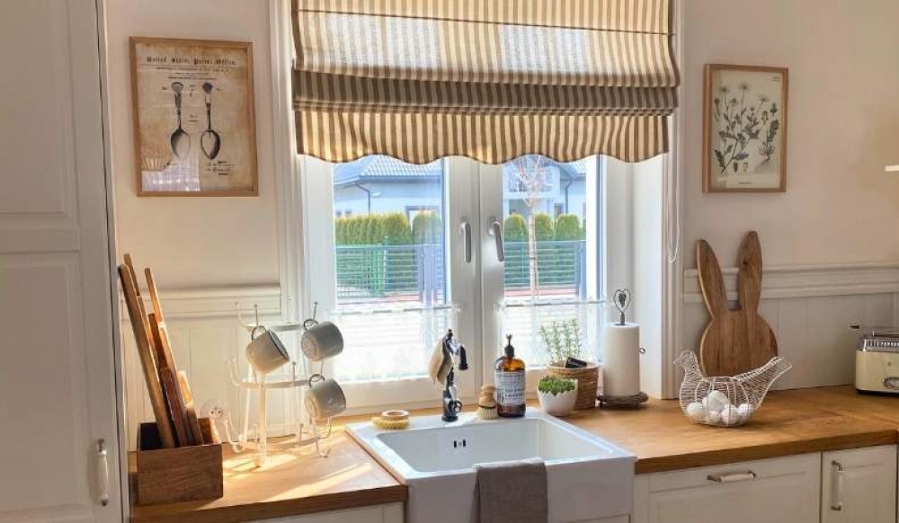
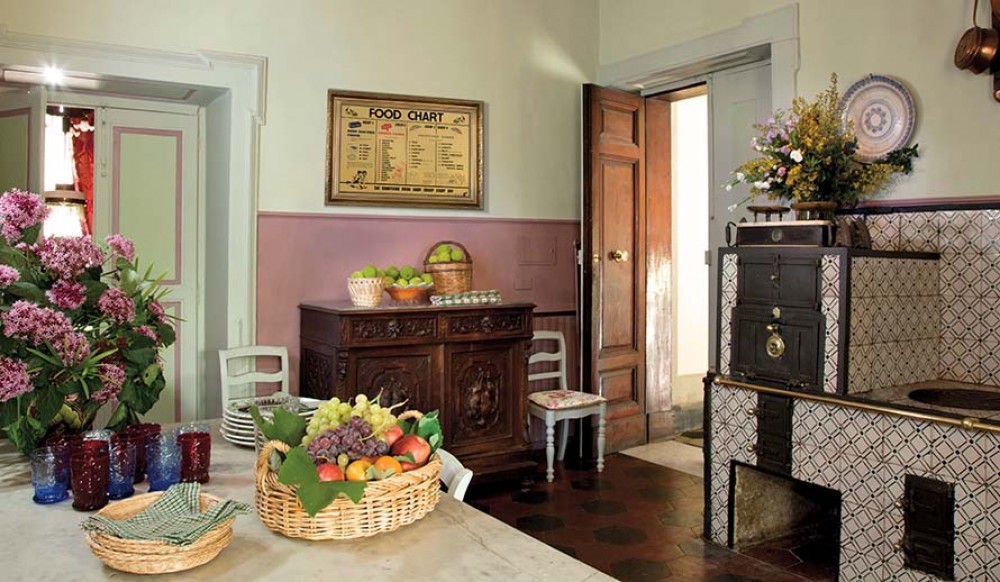
The kitchen plays by slightly different rules than the bedroom. Here you can allow yourself more energy, color, and fun. Vintage posters in the kitchen warm up the space and add a more personal character. These are decorations that may evoke an Italian café, a French market, an old bakery, or a home pantry full of aromatic spices.
For the kitchen, it’s worth choosing posters with coffee, tea, herbs, fruits, vegetables, wine, bread, pasta, spices, or retro food ads. Such designs are light, appetizing, and naturally suit the function of the room.
Graphics inspired by old labels, restaurant menus, or classic advertising posters will also be a good choice. Retro typography, a slightly aged background, and warm colors introduce a pleasant, homey look to the kitchen.
In a white kitchen, posters in warm colors—mustard, red, olive, cream, or brown—look great. They add life to the space and keep it from looking too sterile.
In a kitchen with wooden fronts, retro posters with motifs of coffee, herbs, citrus, or wine work well. The natural material of the furniture pairs beautifully with vintage-style graphics.
In a modern kitchen, choose simpler designs. These can be minimalist posters with a single motif, for example an espresso cup, a sprig of rosemary, or elegant typography. Thanks to this, the decor will be light yet still distinctive.
The kitchen is a place where moisture, steam, and stains are common. Therefore, when choosing a poster, pay attention to quality. Good paper, solid printing, and appropriate framing are key. A poster placed in a frame behind glass will be better protected, especially if it’s going to hang close to the counter or table.
Some decorations can also be made on other substrates, such as canvas or a stiffer decorative material. It’s worth matching the solution to the place where the poster will be used.
The size of a poster affects how the entire arrangement is perceived. A too-small poster on a large wall may look random, while one that’s too large in a small interior can overwhelm the space. Therefore, before buying, it’s good to measure the wall and consider the role the decoration is to play.
Large posters look good above the bed, above the kitchen table, over a dresser, or in a spot meant to be the room’s focal point.
Smaller graphics work well by shelves, next to the coffee maker, by the nightstand, or as part of a larger gallery.
If you’re not sure which format to choose, opt for a set of posters in different sizes. This makes it easier to build a relaxed, artistic composition that won’t look too stiff.
The choice depends on the effect you want to achieve. One large poster introduces order and elegance. It’s a good solution for people who like simplicity and a bold accent. Such a poster can become the decorative center of the bedroom or kitchen.
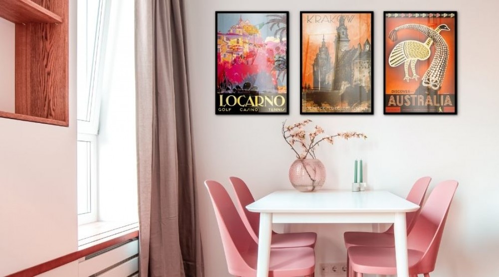
A gallery wall offers more freedom. You can combine vintage posters, small paintings, typographic graphics, reproductions, and personal inspirations. Such a composition works well not only in the bedroom and kitchen, but also in the living room, hallway, and even in a child’s room if you choose gentler motifs.
When creating a gallery, it’s worth sticking to one color palette or a common theme. These can be botanical motifs, travel, Italian cuisine, old ads, botanical engravings, or nostalgic city views.
Framing matters a lot. Well-chosen frames can highlight the character of a poster and make the decoration look more elegant. Wooden, black, gold, white, or aged-metal-tone frames work great with vintage graphics.
Wooden frames warm up the interior and suit the bedroom, kitchen, and boho arrangements.
Black frames add contrast and order.
Gold frames introduce a touch of elegance, especially with posters inspired by old illustrations, art, and classic advertisements.
When choosing a frame, remember that it should match not only the poster, but also the furniture, lamps, handles, textiles, and other accessories. Thanks to this, the decoration will look natural, not like a random element.
A Scandinavian-style interior welcomes light graphics, botanical illustrations, and delicate landscapes. In a boho arrangement, warm colors, plants, the sun, ethnic patterns, and travel posters will work. In a rustic kitchen, motifs of herbs, fruits, old labels, and French markets look beautiful.
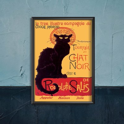
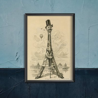
For industrial interiors, you can choose posters in a darker palette, inspired by old ads, automotive, cinema, or typography.
In more classic spaces, reproductions, portraits, elegant graphics, and posters in the style of old engravings will work well.
It’s also worth remembering that posters don’t have to match everything perfectly. Sometimes a slight contrast brings more life to the interior. What matters is that the whole has a common rhythm and fits how you really live.
Although the topic focuses on the bedroom and kitchen, with posters you can transform almost any room. When arranging the living room, it’s worth choosing larger graphics that will be visible from afar and create an elegant backdrop for the sofa or dresser. In the hallway, travel posters, maps, or short slogans in retro typography work well. For the bathroom, you can choose delicate botanical graphics, provided they are properly protected from moisture.
In a child’s room, it’s better to opt for gentle illustrations, animals, fairytale landscapes, or pastel graphics. Vintage posters can be subtle and warm here, without the effect of heavy, grown-up decor.
A poster can also be a good gift idea. If you know someone’s interests, it’s easier to choose a theme related to travel, cuisine, cinema, nature, architecture, or art. Such a gift is personal, decorative, and practical.
Buying a poster without considering where it will hang - Even the most beautiful graphic can lose its charm if it ends up in the wrong place. Before buying, it’s worth looking at the wall, colors, light, and neighboring decorations.
Too random a selection of posters - if every poster has a different style, color, and theme, the arrangement can look chaotic. It’s not about everything being identical, but about maintaining cohesion.
Ignoring proportions - a small graphic above a large bed can disappear, and a huge poster in a narrow kitchen can disrupt harmony. Therefore, when choosing a poster, always check its format and compare it with the place where it is to hang.
Mismatched framing - a poster without a frame can look casual and modern, but in many interiors it’s the frame that adds elegance and makes the whole look more polished.
It’s best to start with one main theme. It can be nature, kitchen, travel, coffee, flowers, art, or old cinema. Next, choose the color palette and sizes. If you want to create a gallery, lay the posters on the floor first and check whether they look good together.
In the bedroom, aim for calm, softness, and harmony. In the kitchen, allow yourself more energy and flavor. In the living room, you can choose more striking graphics, and in the hallway, ones that announce the home’s character right from the entrance.
Remember that decorating is a process. You don’t have to fill all the walls at once. Sometimes one well-chosen poster gives a better effect than several random decorations. Give yourself space for change, testing, and discovering your own style.
The ideal vintage poster is one that fits the interior but also evokes emotions. It can bring to mind a trip, a favorite movie, a family home, a vacation café, or a peaceful garden full of flowers. That’s why vintage wall decorations are so special—they not only adorn, but also tell a story.
Get inspired by old illustrations, nature, cuisine, travel, and art. Choose graphics that truly suit you. Thanks to them, your bedroom can become cozier, your kitchen more appetizing, and your entire home will gain more character, warmth, and nostalgic charm.
