Friday, 10 April 2026 | Blog
Interior transformation with retro posters - step by step

Interior makeover with retro posters is one of those ideas that can transform an apartment completely without renovation, dust, and costly replacement of furnishings. Sometimes a well-thought-out detail on the wall is enough for the entire interior to gain a new rhythm, greater coziness, and above all a more personal character. That’s why vintage posters, inspired by old advertising, travel, film, and illustration, are now so eagerly chosen for the living room, bedroom, and kitchen alike. It’s an interesting solution for people who want to combine sentiment, aesthetics, and mindful decorating of their space.
In this guide, we’ll show you step by step how to carry out a makeover that will give your interior style, lightness, and authentic charm. See where to start, which motifs to choose, how to match frames, what to do so that the elements go well together, and what the final effect really depends on.
The power of retro lies in emotions. Contemporary decor is often well thought-out but at the same time conservative. When vintage posters appear in such a space, the interior immediately gains depth. Instead of an anonymous decoration, you get a detail with a story, a reference to the past, to travel, cinema, advertising, applied arts, or local tradition. Thanks to this, the interior not only looks better but also gains its own character.
This is precisely why an interior makeover with retro posters is so effective. A single well-chosen accent on the wall can break the monotony and make the room more expressive. In the living room, posters can emphasize the representative style and add elegance to the space. In the bedroom, they help build a calm, nostalgic atmosphere. In the kitchen, culinary, advertising, and illustrative motifs work great, adding lightness and a sense of ease. In reality, there are many possibilities because retro doesn’t fit into a single fixed pattern.
It’s also very important that the vintage aesthetic blends well with different interior styles. It suits not only classic vintage decor, but also Scandinavian simplicity, eclectic arrangements, and even loft and minimalist spaces.
It’s also worth remembering that posters are exceptionally flexible in arrangements. You can opt for one large piece or create a gallery, even a full gallery wall, featuring photos, illustrations, photography, typography, and subtle graphics. You can mix formats, change the layout seasonally, choose new frames, or swap out the prints themselves. This gives a freedom that other decor elements, such as heavy paintings or massive accessories, often don’t offer. If you like changes, this solution is made for you.
Importantly, retro is not a trend that quickly fades. Its charm can’t be reduced to fashion alone. It’s a style based on associations, memory, and an aesthetic that attracts with its authenticity. That’s why well-chosen posters can add sophistication to an interior, soften the starkness of contemporary forms, and make the entire apartment start telling its own story. In this sense, they’re not just accessories. They’re a tool with which a truly successful makeover begins.
It’s worth starting the selection of posters not from the design itself but from the function of the room. We perceive differently a space intended for relaxation, another one where we receive guests, and yet another where we handle daily chores. So before you choose specific motifs, pause for a moment and think about what effect you want to achieve. Do you want calm, energy, elegance, or perhaps an interior with a touch of nostalgia? From this point begins a truly successful interior makeover with retro posters.
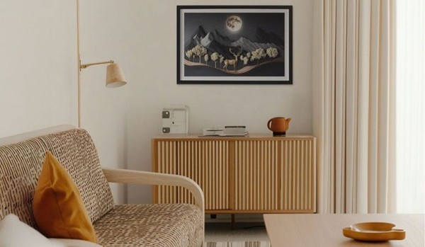
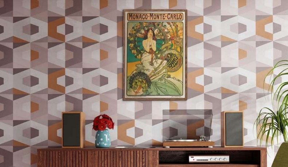
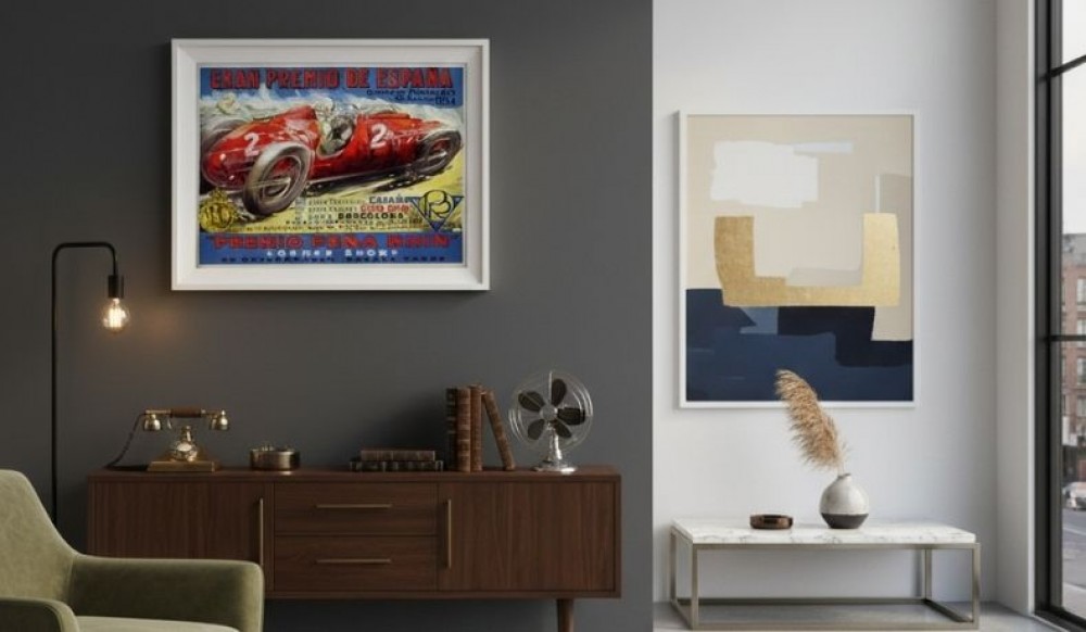
In the living room, larger formats and more expressive compositions work very well. It’s a representative space, so posters can serve as the main accent. Both classic vintage posters inspired by travel and film, advertising, or typographic graphics look great there. If you have a simple sofa, a wooden coffee table, a soft rug, neutral curtains, and a single armchair, a poster can give the interior a stronger edge. In such a place, scale and boldness matter, but without chaos. All the elements should build a coherent narrative, not fight for attention.
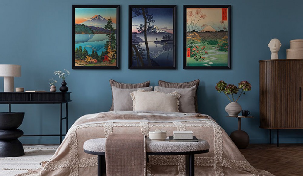
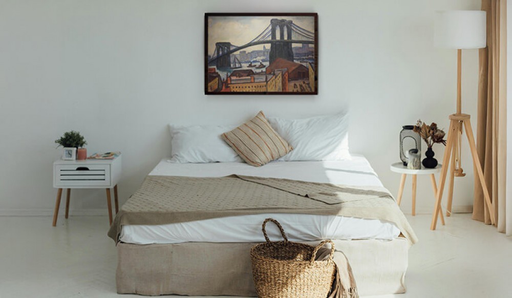
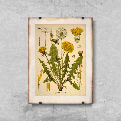
In the bedroom, it’s better to focus on softness. Here, calm, softness, and a subtle atmosphere are key. Light tones, delicate photographs, subtle botanical illustrations, old engravings, and even romantic posters inspired by vintage ads will work well. If the walls are kept in colors such as white, sandy beige, or muted gray, it’s easier to create an atmosphere of lightness and a cozy retreat. In the bedroom, artworks framed in thin wooden or metal frames work particularly well, because they don’t overwhelm and introduce order. It’s here that you can clearly see how important detail is and how much depends on it.
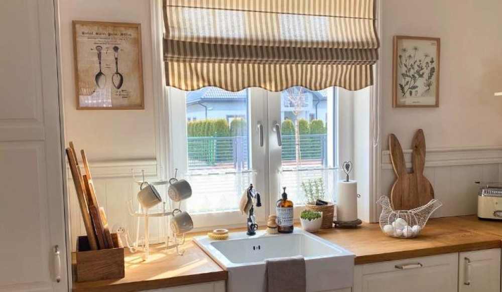
In the kitchen, retro can show a more casual, lighter side. It’s a place where culinary illustrations, ads for old products, posters with coffee, fruit, wine, or old signs are very welcome. This type of wall decor adds energy to the kitchen and makes everyday tasks more pleasant. If you have wooden countertops, simple furniture, light cabinet fronts, and natural wood there, retro-style posters will warm up the decor even more. Even a small graphic above the table or by the shelves can change the perception of the entire space.
You can also use a retro aesthetic in a child’s room; you just have to do it with sensitivity. For children, it’s best to choose light, cheerful, and imaginative illustrations. These can be animals, old maps, vehicles, lettering, or fairy-tale scenes. Such posters give the room a special character but shouldn’t be too visually heavy. Here it’s especially important that the decor stimulates imagination and doesn’t overwhelm. Retro in a child’s room can be very charming if you treat it as inspiration, not a literal reconstruction of an old style.
When choosing posters, also think about what you already have at home:
If natural materials such as wood, linen, and ceramics dominate, try to make sure the posters also have a soft, refined character.
If the interior is more modern, with simple shapes and a limited color palette, retro can become the element that breaks this restraint. And this is exactly where its strength lies.
In modern interiors, an element from the past can look surprisingly fresh. It’s precisely such contrasts that create the most interesting effects and give the apartment a more personal character.
It’s also worth remembering that not every poster has to be the main star of the interior. Sometimes two smaller ones are better than one large one. Sometimes it’s not bold colors but calm patterns that make the biggest impression. Arranging a space isn’t about quantity but about the accuracy of your choices. It’s good to browse inspirations, save interesting ideas, compare different styles, and check which motifs really match your taste. See how the chosen poster harmonizes with fabrics, lamps, accessories, and daylight. Then it’s easier to create an interior in which everything fits together.
The quality of the framing itself is also important. Even the most beautiful piece will lose its impact if it’s poorly displayed. That’s why when choosing frames, pay attention to their color, width, and material. Sometimes a thin black line will emphasize the graphic better than a decorative frame. Another time, natural wood will add softness and refinement. Everything should support the artwork, not drown it out. Thanks to this, the posters won’t be a random store-bought accessory, but a well-thought-out element of the entire arrangement.
The biggest mistake in decorating an interior is acting too quickly. Many people first buy posters and only later wonder where to hang them and whether they’ll match the rest of the furnishings at all. Meanwhile, a good makeover starts with looking at the interior as a whole. First, you need to assess what this space is lacking. Is it too cold? Too empty? Too predictable? Or maybe it’s nice but without a clear character? The answer to this question lets you choose posters that really bring about a change rather than becoming just another decoration.
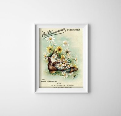
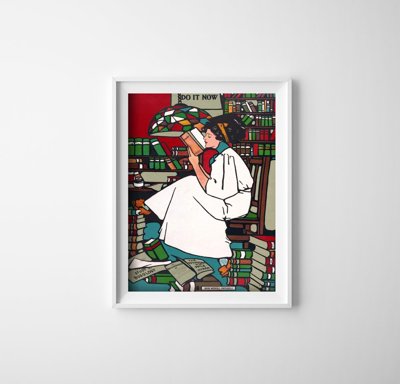
The first step should be to define the aesthetic direction. You don’t have to know everything right away, but it’s good to have a general point of reference. Are you closer to classic retro or a lighter vintage style? Do you want to reference cinema, travel, advertising, nature, or perhaps the essence of Polish design? Many people today choose motifs inspired by old applied illustration, tourism, and visual culture.
The second step is to choose a specific wall. Not every surface is equally suitable for display. It’s best to choose places that are clearly visible and not overloaded with other elements. Space above the sofa, above a sideboard, by the dining table, in the hallway, or above the bed works great. If there’s already a lot going on on the wall—shelves, mirrors, lamps—the effect may be weaker. A poster needs breathing room. It’s the empty space around it that makes it look refined and draws the eye.
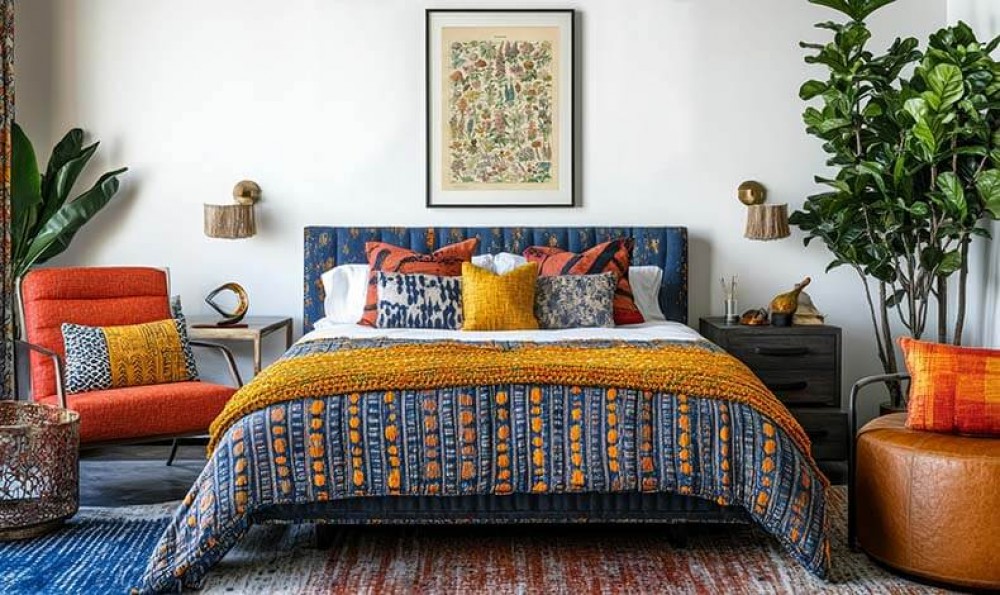
The third stage is evaluating the color scheme of the interior. Check which colors dominate the room and how you can reinforce or break them up. If you have a calm backdrop, neutral furniture, natural fabrics, light upholstery, a simple sofa, and wooden-tone accessories, you can allow yourself a stronger accent. If, on the other hand, the interior already features patterned textiles, bold curtains, decorative rugs, and colorful accessories, it’s better to choose more restrained posters. What matters here is your ability to build relationships between elements so that they form a harmonious whole.
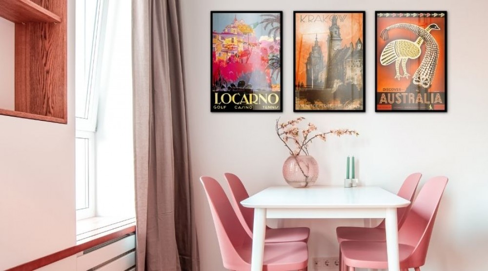
The fourth step is deciding whether you want to go with a single poster or create a gallery. One large piece gives an effect of elegance and calm. A gallery wall, on the other hand, is worth choosing when you want to build a richer story. In such a layout, you can combine photographs, posters, illustrations, and sometimes also small paintings or even family photos if the whole has a more personal dimension. A well-designed gallery wall doesn’t create chaos but order. There’s one condition: all elements must have a common denominator. This can be color, theme, type of frame, or mood.
The fifth stage is preparing the framing and planning the layout. Before you hang anything, lay the posters out on the floor or map out their size on paper. This way, you’ll see how they’ll work together. It’s a simple trick but gives you huge control over the final effect. At this stage you also choose the frames, check the proportions, and decide whether the composition should be symmetrical or more casual. The better you prepare this moment, the easier it is to avoid randomness. And in decor, it’s exactly randomness that most often ruins the final effect.
The sixth step is to complete the interior with accessories. Sometimes after hanging the posters, it turns out that the room needs one more detail for the whole to gain depth. It could be a soft throw, a ceramic lamp, a solid wood side table, a new armchair, classic chairs, or a subtle color accent in the textiles. It’s important that the accessories don’t compete with the posters. They should support the decor, not take control over it. In a well-designed interior, everything works together and builds a shared atmosphere.
At the end, it’s worth taking another look at the space from a distance. Walk through the room, sit on the sofa, look from the entrance, check the proportions and the light. This is the moment when you can best see whether the motifs you chose really work together, whether the interior has gained more charm, and whether this change was truly what you needed. Sometimes the best effects appear not when you add a lot, but when you consciously choose a few things and let them resonate. This is what a good interior makeover with retro posters is all about.
Once you’ve chosen the motifs and the place for display, comes the moment when ordinary decorating turns into mindful design. This is where the effect is created that makes the interior not only look good but really stay in your memory. A well-arranged gallery is not a collection of random accessories. It’s a thoughtful story about style, emotions, and proportions. If you want to create a gallery or a larger gallery wall, treat it like a composition in which every element has its place and significance.
The most important thing is a common denominator. That doesn’t mean all posters have to be identical. On the contrary, the most interesting arrangements appear when you combine different formats, crops, and motifs, but do so according to one rule. Cohesion can come from color, theme, typography, type of frame, or mood. You can pair travel-inspired vintage posters with illustrations inspired by old advertising, add photographs, and place subtle nature- or city-related graphics next to them. If everything is connected by a similar palette or aesthetic, the composition will still be clear.
Building a gallery around a single world of associations is also a great approach. For some, this will be movies, old cinemas, and classic posters; for others, architecture, the sea, mountains, or local identity. In Polish homes, references to the essence of Polish design work extremely well, especially when the inspiration comes from pieces kept in the spirit of Ryszard Kai’s posters and the iconic “Polska” series. Such sets are powerful because they reference a shared visual memory while remaining highly decorative. Thanks to them, the wall gains meaning, not just aesthetics.
In practice, the principle of rhythm works well. If you want to place several pieces on one wall, make sure the spacing is consistent. Let the distances between frames be similar and keep the top or middle line relatively orderly. It’s a simple technique but gives a sense of elegance. Even very diverse artworks and posters will then look like parts of one project. That’s why it’s worth first laying the composition out on the floor, making a few trial arrangements, and even taking photos with your phone to compare variants. Such small documentation, sometimes saved under a working title like “inspiration photo,” helps you evaluate the layout from a distance.
Frames also play a crucial role. They often determine whether the whole looks refined or random. Interiors with a retro vibe handle wood very well, especially light and natural wood, but thin black or muted metallic frames also look interesting. If you want a softer and friendlier effect, choose wood. If you want a stronger contrast, go for a simple, minimalist line. It’s best if all the artworks are framed in a similar way—even if they differ in style. This approach organizes the perception and turns a collection of elements into a harmonious whole.
Also remember the background. In many cases, white or other light colors work best, allowing the graphics to stand out. That doesn’t mean colorful walls are excluded, though. If the interior is moodier, a deeper color can highlight the retro charm. The key lies in proportion. Posters should work for the interior, not compete with it. For this reason, sometimes less is more. Instead of filling the entire wall, it’s better to leave some empty space and let selected pieces truly stand out.
When creating a composition, think about how the eye moves. A good gallery guides the gaze smoothly, without chaos. Sometimes the central point will be one larger poster, and the rest will form a calm backdrop around it. Other times, several similar formats will create an effect of structured elegance. It’s a bit like the art of placing accents in an interior. It’s not just about what you hang on the wall but about what impressions you build. This level is what makes the decor come to life.
It’s worth staying brave here. Not everything has to be perfectly symmetrical. In some apartments, a looser layout looks more natural and adds lightness to the space. If you value creativity, you can combine posters with a small mirror, a simple shelf, or even a single typographic piece. Well-chosen lettering, the style of writing on old posters, or distinctive typographic patterns can bring a unique rhythm into the interior. Such a gallery not only decorates but truly tells a story.
Posters can make a huge impression, but it’s the accessories that make the makeover feel complete. If you want the wall to gain the right setting, take care of elements that will work together with it. It’s not about decorating the entire apartment like a stage set from a bygone era. Subtle references to the past, combined with the comfort of modern life, work much better. That’s exactly why retro fits so well in contemporary interiors.
Furniture plays a very important role. A simple sofa, a neat armchair, light chairs with wooden elements, or a sideboard with gently rounded lines can perfectly complement a wall with posters. You don’t have to replace everything. Sometimes one detail is enough for the decor to take on a more distinctive tone. It might be a solid wood coffee table, a small bookcase, a lamp with a milky shade, or a restored piece of furniture with soul. Such objects reinforce the mood but don’t dominate the decor.
Textiles are also extremely important. If you want to warm up the space, choose soft rugs, light curtains, throws, and pillows in calm shades. Retro loves materials that look natural and pleasant. Linen, cotton, wool, textures inspired by handicrafts, and subtle geometric patterns can highlight the character of a wall with posters. Thanks to them, the interior becomes more welcoming and gains what it often lacks most: a sense of warmth and coziness.
Repeating small details is also a good idea. If a warm shade of red appears in the posters, you can subtly echo it in a pillow, vase, or curtain. If the frames are wooden, let wood appear in other points of the room as well. Such small repetitions make everything start to fit together. You no longer see separate elements but one well-thought-out whole. And that’s when the arrangement gains real depth.
A well-executed interior makeover with retro posters doesn’t require a big budget or a full renovation. The most important things are the idea, consistency, and a sense of taste. When you consciously choose vintage posters, matching frames, accessories, and colors, you create a space that not only looks beautiful but also has soul. Such an interior tells the story of you—your taste, memories, and way of looking at aesthetics.
Don’t be afraid of change. Sometimes a single wall, one poster, or one detail is enough for the entire space to gain a new meaning. And if you want the effect to be even better, go back to your own inspirations, save interesting ideas, take photos of trial layouts, and treat decorating as a process. Even such everyday, at-home navigation of a project through consecutive decor decisions can become a pleasure. After all, a well-designed interior is not just about decoration and aesthetics. It’s a place where life simply feels good.
